We use cookies to make your experience better. To comply with the new e-Privacy directive, we need to ask for your consent to set the cookies. Learn more.
Barons has Rebranded!
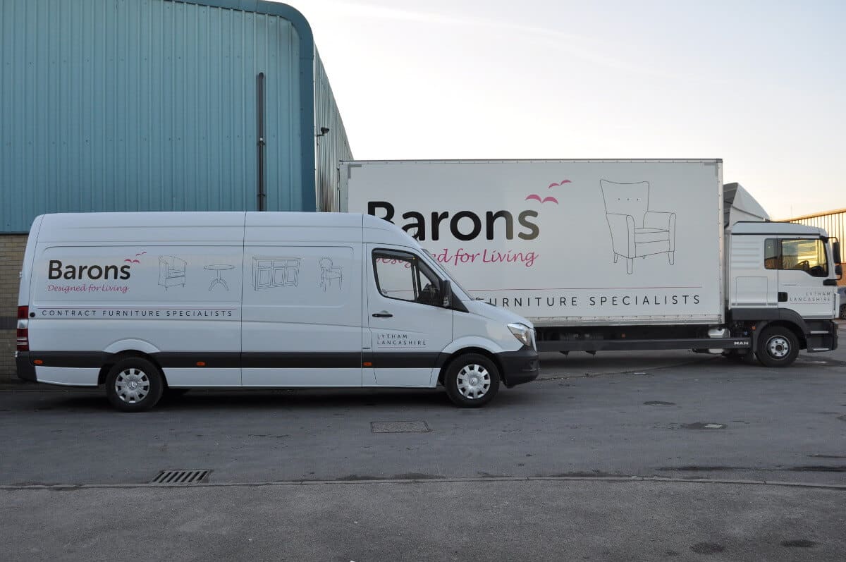
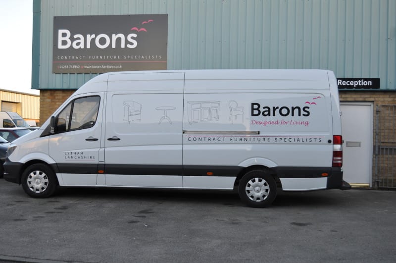
We’ve moved on from our previous brand colours of pink and green. Instead, we’re introducing crisp black, clean white and fuchsia. We feel these corporate colours better represent us as a company.
To reflect our fresh new image and enhanced product range we have gone through a complete rebrand. We’ve moved on from our previous brand colours of pink and green in favour of crisp black, clean white and fuchsia.
Our logo and tagline have had a refresh too, with the addition of the fuchsia seagulls to bring it to life.
We even found out that seagulls are a symbol of freedom, which ties in so well with our tagline!
‘Designed for Living’ perfectly summarises how our furniture is just the right balance between cutting-edge design and practicality, promoting freedom and independence for residents.
The seagulls are even more perfect as we’re based in Lytham on the Fylde coast!